Phuong Tran
Hi! I'm an analytics professional who has a strong passion for delivering business insights and creating product innovation through the power of data.
Currently, I'm a candidate for the Master of Science in Business Analytics at the University of Minnesota, Carlson School of Management.

Web Scraping and Detect Recipe Trends
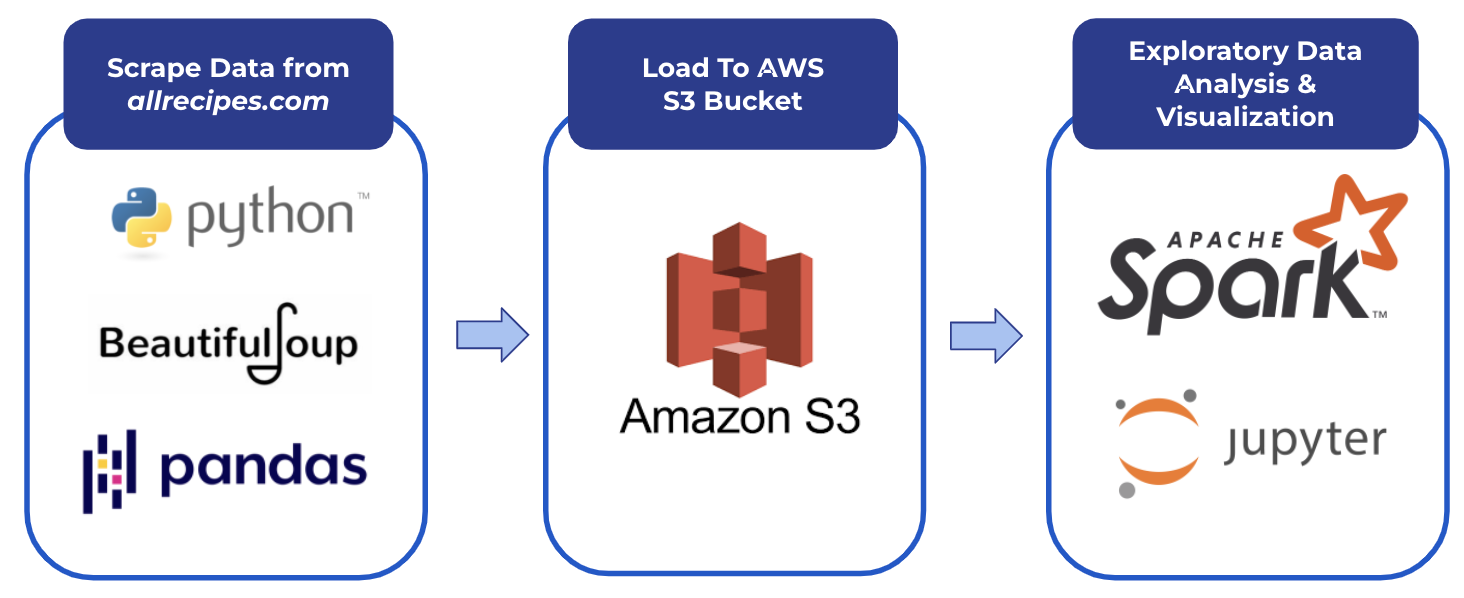
Food recipe websites is a highly competitive space, where any data that could improve customer satisfaction could give an edge against competitors. In this project, we webscraped 13,000+ recipes to analyze factors that could contribute to a higher customer satisfaction measured by star ratings from 1 to 5. We pulled various attributes and performed exploratory analysis.
Interesting findings:
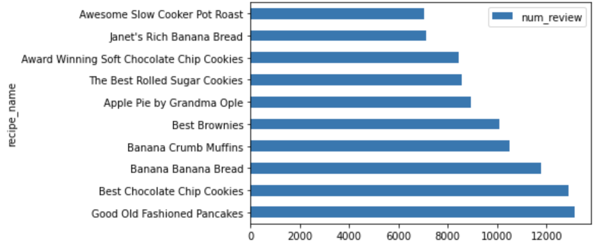
• The top rated and most-reviewed recipes tend to belong to the desert category, such as chocolate chip cookies, pancakes, banana bread, muffins.
• It’s possible that readers tend to gravitate towards recipes with an average cooking time of around 2-2.5 hours.
• Customers were agnostic of nutrition information and are more favorable to websites with high reviews.
Improvement: Build a better data pipeline, including creating a table within RedShift, cleaning the table in a staging area, and then feeding the table to Spark for analysis. This would lead to higher scalability than our adhoc analysis.
Dynamic A/B Testing for Banner Optimization
A/B testing is largely implemented in the market today to analyze whether or not a business decision needs to be made. Most businesses fail to review and update their “best strategy” on a regular basis due to a multitude of factors. In this project, we use a banner showing case to demonstrate how business operations can potentially benefit from continous A/B testing and dynamic strategy choosing.
Compared to the traditional A/B testing method, our solution archtecture can:
• Create streaming dashboards to visualize the results
• Constantly review the experiment & adjust setting automatically, thus reducing human’s efforts
• Maximize the profits
• Potential to scale up
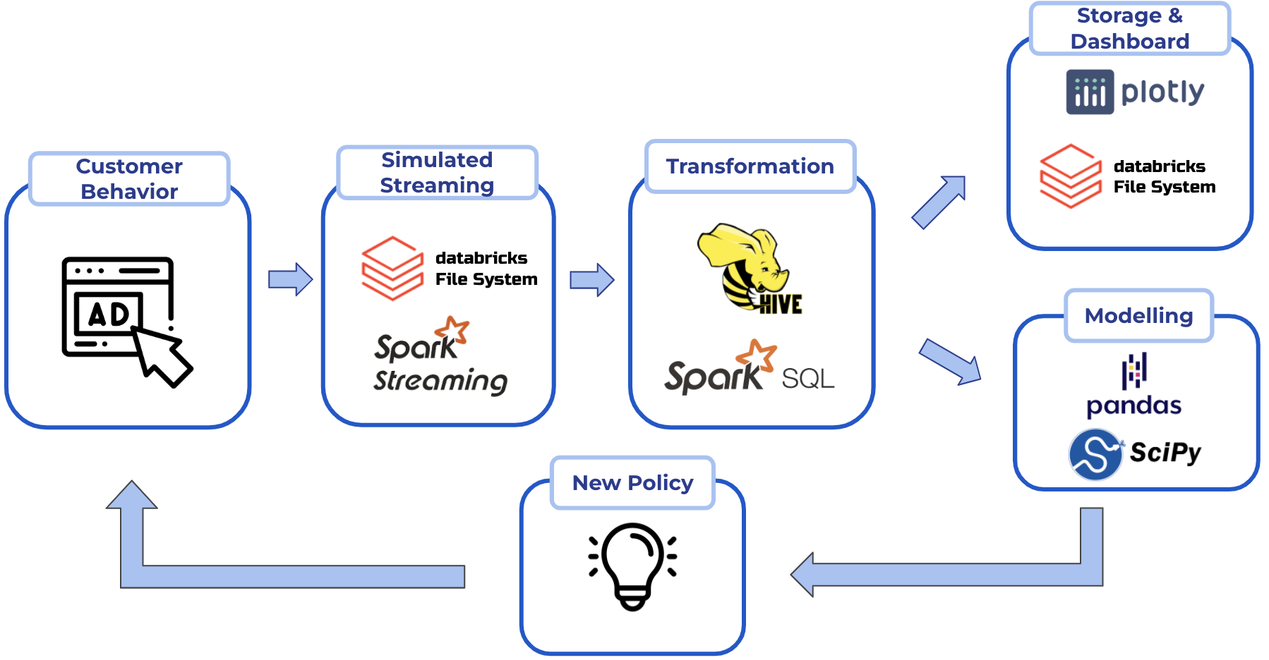
Big Data Architecture
Streaming Dashboard Demo
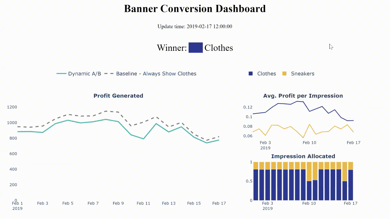
As customers enter the website, there are two banner candidates, sneakers and clothes banner. Using the traditional approach of A/B testing, the clothes banner is chosen as the winner, which is shown to customers at all time. However, as time progresses, there is a decline in profit associated with the clothes banner due to various reasons, as shown in the dash line of the left graph.
Our dynamic solution is able to detect the change in profit because it always allocates a small proportion of impressions to the losing banner. Therefore, as the profit of the clothes banner decreases, it can allocate more impressions to the sneakers banner and switch the winner accordingly.
Results:
Our method achieves 92% of the perfect scenario, comparing to 83% and 84% of the traditional A/B and show half and half.
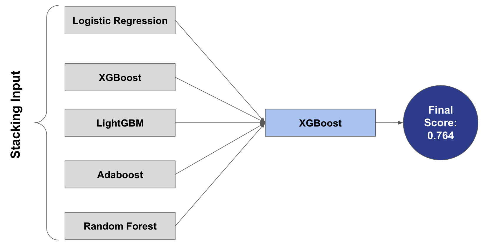
Predict Ability to Repay Loan
Home Credit is an international consumer finance provider, whose goal is to provide a safe experience for people who have little or no credit history. In order to create a positive borrowing experience for the customers, Home Credit utilizes a variety of data attributes to predict a customer’ ability to repay loan. Our goal is to generate additional meaningful features and perform predictive modeling to help Home Credit better distinguish between the customers who are loan defaulters vs customers who are not. This will allow Home Credit to maximize successful loan applications that will further empower underserved clients financially
We implemented stacking, in which we stacked Logistic Regression, XGboost, Adaboost, LightGBM and RandomForest as the base estimators using the best parameters from GridSearch and RandomizedSearch. The final estimator is taking the predictions of the previously tuned models as input, flowing through another XGBoost model in order to conduct predictions.
Visualization
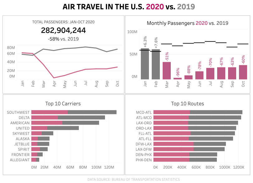
Covid-19 has dratistically affected the airline industry due to travel bans and restrictions. Curious about how the industry’s traffic in 2020, I compared the air travel trends (total passengers, monthly passengers, top 10 carriers, and routes) in the U.S. between 2020 and 2019:
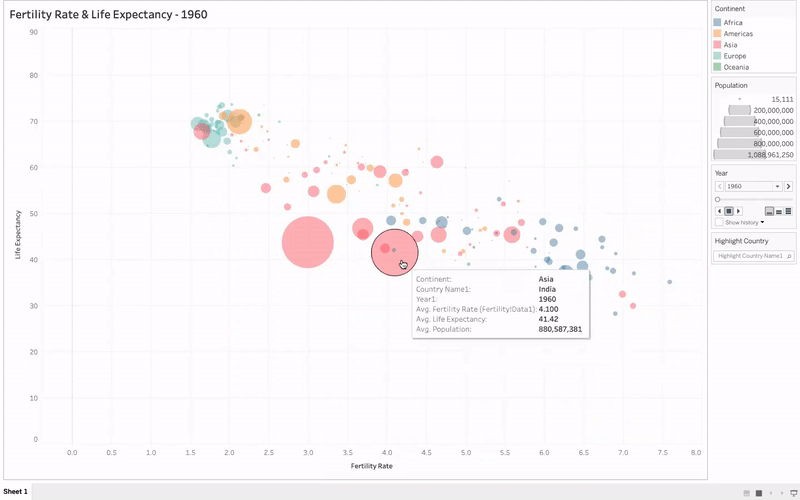
Animated Bubble Chart: Tracking the average fertility rate and average life expectancy of countries categorized by continent from 1960 to 2019. The size of the bubble is based on the country’s population.
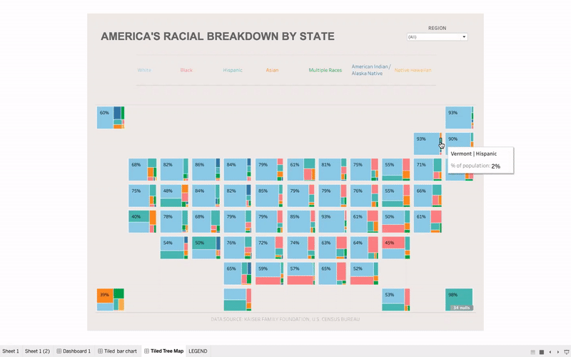
Interested in how the racial breakdown by state in the U.S., I created this map chart to see the percentage of race in every state. The dashboard could be filtered by Race (White, Black, Hispanic, Asian, Multiple Races, American Indian/Alaska Native, and Native Hawaiian), Region (Midwest, Northeast, South, West), and State.